
 GROWTH GUIDE
30/60/90 Plan to Hit 5–8% Service Website Conversions
Your conversions are phone calls, contact form fills, and booked consultations, not pageviews. If you fix only three things this week, fix these: rewrite your hero section so a visitor knows who you serve and what to do in three seconds, put a clickable phone number where mobile thumbs land, and get your Core Web Vitals out of the red. Then mark a generate_lead event as a GA4 key event so you can actually see whether any of it worked.
TL;DR:
- Prioritize fixing your hero section clarity, placing a clickable phone number in the top navigation and ensuring Core Web Vitals are in the green to boost conversions.
- Track all key conversions, including calls and booked appointments, using
generate_leadevents in GA4 to prevent double-counting and improve attribution accuracy.- Focus on quick-impact site elements like mobile-friendly tap targets, sticky call buttons, and dedicated service pages over design polish for faster results.
- Use end-to-end testing of forms, calls, and tracking setup to verify data flows correctly and avoid misleading lead counts.
- Implement a 30/60/90-day plan that starts with analytics setup and hero testing, progresses through mobile experience fixes, and finishes with technical performance improvements and ongoing testing.
Table of Contents
- What Counts as a Service Website Conversion (and What’s a Good Rate)?
- How Do You Measure Conversions Correctly on a Service Site?
- Which Site Elements Move the Conversion Needle Fastest?
- What Form Design Rules Actually Reduce Abandonment?
- How Much Does Page Speed Really Affect Conversions?
- How Do You Build a Testing Program That Actually Proves Results?
- What’s a Realistic 30/60/90-Day Plan to Improve Conversions?
- How Customer Journey Mapping Uncovers Hidden Conversion Gaps
- Why You Need Both Numbers and Real Feedback to Know What’s Broken
- Can Personalization Really Boost Service Website Conversions?
- What Should You Fix on Mobile Beyond the Contact Form?
- What Actually Moves the Needle for Service Businesses
- Where Service Grower Fits Into Your Conversion Plan
- Sources
- FAQ
What Counts as a Service Website Conversion (and What’s a Good Rate)?
A conversion, for a service business, is any action that puts a real prospect in front of a real person: a phone call, a submitted contact form, or a booked appointment.
Service sites should weight phone calls and bookings above form fills, not treat them as equals. A homeowner calling about a burst pipe wants a human now. A form fill from that same visitor might sit in an inbox until Monday. Both are conversions, but they carry different urgency and different close rates, and your reporting should reflect that instead of lumping them into one generic “leads” number.
Industry data on service-business conversion rates puts typical performance in the 2% to 4% range, with strong sites built around clear positioning, visible phone numbers, and fast load times reaching 5% to 8%. Category matters too: emergency services (plumbing, locksmiths, urgent legal help) tend to convert higher because intent is immediate, while consultative services (financial planning, interior design) convert lower because the buying decision takes longer.
Traffic source changes the math again. A visitor who searched “[your service] near me” and clicked a paid ad is closer to converting than someone who landed on a blog post from an organic search. Segment your conversion rate by channel, not just by site total, and you’ll see patterns like this:
- Paid search traffic often converts higher because intent is explicit in the query itself.
- Organic traffic from informational content converts lower but at larger volume, and often needs a nurture step.
- Direct traffic (people typing your URL or clicking a saved bookmark) usually converts highest of all, because they already know your brand.
- Social traffic tends to convert lowest unless the offer is highly specific.
If you’re only looking at one blended number, you’re averaging away the story that tells you where to spend money next.
How Do You Measure Conversions Correctly on a Service Site?
Set up your tracking before you touch a single design element, because you can’t improve what you can’t measure accurately. Here’s the sequence that actually works:
- Mark
generate_leadas a GA4 key event. Most service sites default to tracking generic form submissions, which misses calls and mixes real leads with spam. Using the standardgenerate_leadevent, then creating a Google Ads conversion from that key event, keeps your reporting consistent across GA4 and your ad account instead of showing two different lead counts to two different dashboards. - Define what actually counts as a conversion. A form submit counts. A
tel:link click that results in an answered call counts. A completed booking counts. Atel:click where nobody picks up does not, and if you don’t separate the two, you’ll overstate your call volume and underprice your cost per lead. - Layer in call tracking. Dynamic number insertion or a dedicated call-tracking line lets you attribute calls back to the specific channel, campaign, or even keyword that generated them. Reconcile that telephony data against your GA4 events and your CRM weekly, not quarterly, so discrepancies get caught while you can still remember what changed.
- Verify end to end. Submit a test form. Call your own tracking number. Check that both show up in GA4, in Google Ads as a conversion, and in your CRM with matching timestamps. If any link in that chain breaks, your numbers are lying to you and you won’t know which direction.
Quick reality check: Google’s own Analytics documentation on conversions versus key events explains that key events give you the cross-platform consistency needed to bid intelligently in Google Ads. Skip this step and your ad platform is optimizing toward the wrong signal, spending your budget chasing clicks that never became a lead.
Double-counting is the silent killer here. If a visitor fills out a form and then calls to follow up, and both trigger separate conversion events, your dashboard reports two leads from one prospect. Set up de-duplication logic in GA4, or at minimum flag repeat contacts in your CRM, so your cost-per-lead math isn’t quietly inflated by your own tracking setup.
Which Site Elements Move the Conversion Needle Fastest?
Not every fix pays back at the same rate. Some changes move the needle within days; others take months of engineering work for a fraction of the return. Here’s where to spend your first hours.
Hero section clarity comes first, always. A visitor decides in about three seconds whether your page is for them. Your hero needs to answer three questions without scrolling: who do you serve, what problem do you solve, and what happens if they click your button. “Emergency HVAC repair in your neighborhood, technician at your door within 90 minutes” beats “Quality Heating and Cooling Solutions” every time, because one is a promise and the other is wallpaper.
Phone placement is not optional for service businesses. Put your number in the top navigation on desktop, and make it a tap-to-call button that’s sticky on mobile, meaning it stays visible as the visitor scrolls. A phone number buried in a footer is a phone number nobody dials. If your site currently hides the number behind a “Contact Us” page, that’s costing you calls right now.
CTA cadence matters more than CTA design. You need a call-to-action near the top, one after you’ve made your case in the middle of the page, and one at the bottom for the visitor who read everything first. Use verbs that describe the outcome, “Get a Free Quote,” “Book Your Inspection,” rather than vague labels like “Submit” or “Learn More.” Color matters less than most designers claim; contrast and repetition matter more.
Service-specific pages outperform one generic services page every time. A dedicated page for “Drain Cleaning” that addresses that specific problem, with specific pricing signals and specific urgency, converts better than a paragraph buried inside a broader “Plumbing Services” page. Microcopy that pre-qualifies, like “Most jobs completed same day,” reduces the friction of a visitor wondering if you’re even the right fit before they pick up the phone.
Trust signals need specificity to work. A wall of five-star icons with no names attached reads as decoration. A testimonial with a real name, a neighborhood, and the specific job done reads as evidence. Named owner bios, licensing numbers, and years-in-business callouts all do real work here, especially for services where the buyer is inviting a stranger into their home. A structured checklist of conversion elements for service businesses walks through these signals in more depth if you want a full audit framework.
- Hero: who, what problem, what happens next
- Phone: visible, tappable, sticky on mobile
- CTAs: three per page, outcome-focused verbs
- Service pages: one per service, not one page for everything
- Trust signals: named, specific, verifiable
Pro Tip: Test your hero section on a phone with the sound off and the screen brightness low, the way most people actually browse while distracted. If you can’t tell what the business does in three seconds under those conditions, neither can your visitors.
What Form Design Rules Actually Reduce Abandonment?
Every field you add to a contact form is a reason for someone to leave without submitting it. The fix isn’t clever design, it’s subtraction.
Limit your initial contact form to the fields you genuinely need to start a conversation: name, phone or email, and a one-line description of the need. Save the profiling questions, budget range, property size, preferred appointment window, for a follow-up call or a second-step form after the lead is captured. A shorter first ask converts more people into the funnel, and you can qualify them once you have their contact information in hand.
Label every field as required or optional, explicitly, not by convention. Baymard’s UX research on form fields found that most sites mark only required fields and leave optional ones ambiguous, which increases validation errors and abandonment because visitors fill out fields they didn’t need to, then get frustrated when the form rejects unrelated input. Marking both explicitly is rare enough across the web that doing it yourself is a genuine differentiator, not a cosmetic nicety.
A few more specifics that consistently reduce drop-off:
- Use inline validation that flags an error the moment a field loses focus, not after the visitor hits submit and sees five errors at once.
- Label fields with autofill-friendly names (“Full Name,” “Phone Number”) so browser autofill actually populates them correctly.
- Use address lookup or autocomplete for any service that requires a service address, since typing a full address on mobile is where a lot of people quietly give up.
- Avoid CAPTCHA unless spam is a proven problem; it adds friction for a threat that a honeypot field often handles just as well.
Scheduling widgets versus callback requests depends on your sales cycle. If your service has predictable time slots, an HVAC maintenance visit, a consultation call, embed a scheduling widget directly on the page so the visitor books a specific time without a back-and-forth. If your service needs a diagnostic conversation first, a plumbing issue that could be simple or could be serious, a callback request with a short form and a promised response window (“We’ll call you within 15 minutes”) converts better because it doesn’t ask the visitor to commit to a slot before you’ve even assessed the problem.
How Much Does Page Speed Really Affect Conversions?
More than most site owners assume, and the effect isn’t a straight line. It’s a cliff.
Google’s Core Web Vitals measure three things that correlate directly with whether someone sticks around: Largest Contentful Paint (LCP), how long the main content takes to load; Interaction to Next Paint (INP), how quickly the page responds when someone taps or clicks; and Cumulative Layout Shift (CLS), how much the page jumps around while loading. The generally accepted “good” thresholds are an LCP under 2.5 seconds, an INP under 200 milliseconds, and a CLS score under 0.1.
The business impact isn’t gradual. A detailed guide to Core Web Vitals shows that conversion and revenue effects tend to show up as step-changes around common thresholds, meaning a site that improves LCP from 4 seconds to 2.4 seconds can see a disproportionate jump in conversions, far more than the improvement from 2.4 seconds to 1.8 seconds would produce. Crossing the threshold matters more than the raw number. That same research notes page-speed fixes often show measurable conversion movement within 7 to 14 days, which makes performance work one of the fastest-payback levers on this entire list.
Faster pages also lower your Google Ads costs, since landing page experience factors into Quality Score and therefore your cost per click.
Here’s where most service sites lose speed, and the fix for each:
- Uncompressed hero images. Compress and serve modern formats (WebP or AVIF) instead of raw JPEGs straight from a camera.
- Blocking third-party scripts. Chat widgets, review plugins, and ad pixels that load before your content does. Defer anything that isn’t essential to the first paint.
- No CDN. A content delivery network cuts the physical distance data travels to your visitor, which matters more than people expect for mobile users on cellular connections.
- Cheap or shared hosting. Optimized hosting built for your platform costs more monthly but pays for itself in conversion lift if your current host is the bottleneck.
Don’t chase your average load time. Use Real User Monitoring or Chrome UX Report data and look at your p75, the speed experienced by your slowest 25% of real visitors, because that cohort is usually where the biggest conversion losses hide and the biggest gains wait.
| Metric | Good threshold | Common mobile problem |
|---|---|---|
| LCP | Under 2.5 seconds | Unoptimized hero image or video |
| INP | Under 200 milliseconds | Heavy JavaScript blocking taps |
| CLS | Under 0.1 | Ads or images loading without reserved space |
How Do You Build a Testing Program That Actually Proves Results?
Guessing which change helped is how most CRO efforts quietly stall. A/B testing, comparing a changed version of a page against the original with real traffic split between them, is what turns a hunch into evidence.
Start by prioritizing what to test with a simple impact-versus-effort matrix. A hero rewrite is high impact and low effort, so it goes first. A full landing-page rebuild is high impact but high effort, so it goes on the roadmap but not this week. A button color change is low impact and low effort, worth doing but never worth arguing about.
- Write a hypothesis before you build anything. “Adding a visible phone number to the hero will increase call conversions because mobile visitors currently have to scroll to find contact information” is testable. “Let’s try a new look” is not.
- Pick one KPI per test. If you’re testing hero copy, measure lead generation events, not time on page or scroll depth, which can move without meaning anything.
- Check your sample size before you start. Low-traffic service sites often don’t get enough visitors to reach statistical confidence in a reasonable window, so segment less and test bigger swings instead of tiny tweaks that need huge volume to prove out.
- Run it long enough to cover a full weekly cycle. Service businesses often see different behavior Monday versus Saturday, and stopping a test after three days risks a false positive from one unusual day.
Pro Tip: *Before you test anything, calculate your current cost per lead.
Recovering even a small share of visitors currently abandoning the site can produce outsized annual gains once you do the math on lifetime customer value, a pattern Baymard’s abandonment research documents well beyond retail contexts. Use that framing when you need buy-in from a partner or a boss who thinks CRO is a nice-to-have.
What’s a Realistic 30/60/90-Day Plan to Improve Conversions?
Spreading every fix across three months, in the right order, keeps the work from collapsing into a pile of good intentions.
Days 1 to 30: Foundations. Align your analytics first, mark generate_lead as a GA4 key event, connect it to Google Ads, and verify tracking end to end. Run your hero rewrite as your first A/B test. Add a sticky click-to-call button on mobile. Prune your contact form down to essential fields only. Success checkpoint: you can report an accurate weekly lead count broken out by phone versus form, with zero double-counted entries.
Days 31 to 60: Experience. Fix mobile UX friction your analytics flagged in month one, usually navigation or tap-target sizing. Integrate a call-tracking system if you haven’t already. Compress and modernize every image above the fold across your top five pages by traffic. Success checkpoint: mobile conversion rate should show visible movement, and you should be able to attribute calls to specific channels for the first time.
Days 61 to 90: Engineering and scale. Tackle the Core Web Vitals issues that need developer time, deferred scripts, hosting upgrades, layout shift fixes. Rebuild your highest-traffic service page using what months one and two taught you. Put a lightweight, repeatable A/B testing process in place so testing doesn’t stop when this 90-day sprint ends. Success checkpoint: your site should sit inside or near the 5% to 8% “strong performer” benchmark range for its category, with a testing cadence built to keep improving it.
Report progress every two weeks during months one and two, then monthly once the program stabilizes. Weekly reporting early catches tracking errors before they compound; monthly reporting later avoids reacting to normal week-to-week noise.
- Month 1: tracking accuracy and hero/phone fixes
- Month 2: mobile UX and call attribution
- Month 3: engineering fixes and a repeatable testing cadence
How Customer Journey Mapping Uncovers Hidden Conversion Gaps
Most conversion audits look at a single page in isolation, when the actual leak usually happens between pages. A customer journey map traces the path a real prospect takes: search result to landing page, landing page to service page, service page to form or phone call, and every drop-off point in between gets a spotlight it wouldn’t get from a page-by-page review.

Building one starts with your analytics, not a whiteboard exercise. Pull your top entry pages, watch where visitors go next, and find the pages people land on but never leave from in any useful direction, no click, no scroll to a CTA, no exit to a service page. That’s a dead end in your funnel, and it’s often invisible until you map the sequence rather than the individual page.
Service businesses have a particular journey quirk worth naming: a lot of visitors research on desktop during the day and convert on mobile that evening, or vice versa, after a friend recommendation. If your journey map only tracks single-session behavior, you’ll miss that pattern entirely and misattribute a conversion to the wrong touchpoint.
The gap that shows up most often in service-business journey maps is between the service page and the contact step. A visitor gets convinced you’re the right fit, then can’t find the phone number or form without scrolling back up or hunting through navigation. That’s not a persuasion problem, it’s a wayfinding problem, and it’s usually a five-minute fix once the map makes it visible.
Why You Need Both Numbers and Real Feedback to Know What’s Broken
Your analytics tell you where people leave. They rarely tell you why. That’s the gap qualitative feedback fills, and skipping it means you’re optimizing based on guesses about visitor intent.
Session recordings, tools that replay anonymized mouse movement and scrolling as a visitor actually experienced your page, are the fastest way to spot friction your numbers only hint at. Watch ten sessions on your contact page and you’ll often see the same stumble repeatedly: someone hovering over a field, backing away, scrolling to compare it against another section, then abandoning. That’s a labeling problem or a trust gap your bounce-rate number can’t diagnose on its own.
Short, targeted surveys add the layer session recordings can’t reach: intent. A single exit-intent question, “What stopped you from contacting us today?”, with four or five likely answers plus an open text field, will surface patterns you’d never guess from behavioral data alone. Price concerns, unclear service area, missing information about a specific problem, these show up in survey text far more clearly than in a heatmap.
The mistake most site owners make is treating qualitative and quantitative data as separate projects instead of one investigation. Pull your worst-converting page from GA4, watch five session recordings of visitors on that exact page, then run a one-question survey there for two weeks. You’ll walk away with a specific, fixable hypothesis instead of a vague sense that “the page isn’t working,” and that specificity is what makes your next A/B test actually worth running.
Can Personalization Really Boost Service Website Conversions?
Personalization for a service business doesn’t mean a name in a headline. It means showing the right visitor the right service, urgency, and proof at the right moment.
Location-based personalization is the easiest starting point and often the highest impact. A visitor searching from a specific city or neighborhood should see that location reflected back, service area confirmation, local landmarks or neighborhoods named, a phone number with a matching area code where relevant, because it answers the unspoken question “do you actually cover where I live?” before the visitor has to hunt for the answer.
Traffic-source personalization matters almost as much. A visitor who clicked a Google Ads campaign for “emergency water heater repair” should land on a page about emergency water heater repair, not your generic homepage where they have to relocate the exact thing that made them click in the first place. Matching landing page content to ad intent, sometimes called message match, is one of the more reliable conversion levers available and costs nothing beyond building the right page.
Returning-visitor personalization is underused. If someone visited your pricing or service page last week and comes back, a subtle change, a different CTA like “Ready to schedule?” instead of “Learn More”, acknowledges where they already are in the decision without being invasive.
Where personalization backfires is when it feels like surveillance rather than relevance. A banner that says “Welcome back!” with no context creeps people out; a page that quietly shows the right service area and the right urgency message doesn’t. Keep personalization tied to genuine context (location, source, prior page) rather than anything that reads as tracking someone too closely.
What Should You Fix on Mobile Beyond the Contact Form?
Form UX gets most of the attention in mobile optimization guides, but plenty of service-business leads die before a visitor ever reaches the form.
Tap targets across your entire site need to be large enough for a thumb, not a mouse cursor, generally at least 44 pixels tall with enough surrounding space that a visitor doesn’t accidentally tap your phone number when they meant to tap a menu link. Cramped navigation is one of the quieter conversion killers on mobile because the frustration it causes rarely gets reported; people just leave.
Thumb-zone placement matters more than most designers account for. The bottom third of a mobile screen is where thumbs naturally rest, which is exactly why a sticky call-to-call button anchored there consistently outperforms one buried at the top of a long page a visitor has to scroll back to reach.
Click-to-call needs to actually work as a tap-and-dial action, not a styled phone number that looks tappable but isn’t wired with a tel: link. Test this on an actual phone, not a browser’s mobile simulation, because simulators don’t always catch broken tel: formatting.
Pop-ups and interstitials that work fine on desktop often break mobile conversion outright. A newsletter signup overlay that covers the whole screen and requires hunting for a tiny close button is a near-guaranteed way to lose a visitor who was one scroll away from your contact section.
Finally, test your load experience on an actual mid-range Android device on cellular data, not your own new phone on office WiFi. The gap between how your site performs for you and how it performs for a real visitor on a three-year-old phone is usually where the truth about mobile conversions lives.
What Actually Moves the Needle for Service Businesses
Most conversion advice treats every website the same, ecommerce tactics dressed up for service businesses that have a completely different buying decision. A shopper adding a candle to a cart and a homeowner deciding who fixes their roof are not making the same kind of choice, and a lot of generic CRO advice quietly assumes they are.
The conventional wisdom oversells design polish and undersells measurement. We’ve audited plenty of sites with a beautiful hero and no idea whether their form actually reaches a CRM, or whether half their “leads” are the same person calling twice. Fix visibility into what’s happening before you fix what things look like.
Prioritize in this order: get your generate_lead tracking accurate first, because every decision after that depends on trustworthy numbers. Then fix the things a phone-driven business lives or dies on, hero clarity and mobile call access, because those produce fast lead volume increases. Engineering fixes like Core Web Vitals matter and pay back well, but they’re a second-month project, not a first-week one, for most service companies working with limited resources.
— Service Grower
Where Service Grower Fits Into Your Conversion Plan
If everything above sounds like a lot to build and maintain yourself, that’s the exact problem Service Grower was built to solve. Instead of piecing together a website builder, a review tool, a booking widget, and a separate analytics dashboard, you get one managed system: AnswerReady™ Websites built around the hero clarity and service-page structure described above, SmartRequest for booking and lead capture, GrowthView for the analytics and reporting that turns raw visits into a real cost-per-lead number, and review management that builds the trust signals this article keeps circling back to.
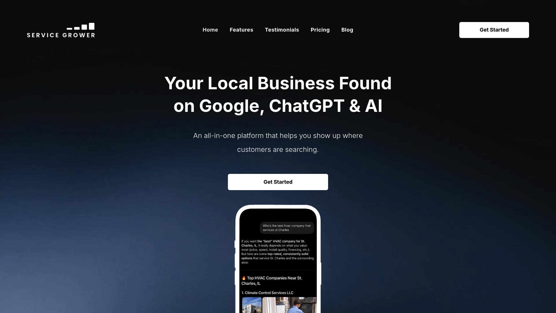
Businesses using an integrated system that consolidates their online presence into one platform instead of managing scattered tools can achieve meaningful increases in bookings and reviews. The Service Grower plan runs $249 per month and includes the core platform; if you also want managed advertising, Google Ads or Meta Ads management is available at $249 per month each on top of the base plan.
The honest next step is a straightforward one: visit the pricing page and see what’s included at your service level, or talk to sales about what a full audit of your current site would surface. Most conversations start with the same question this article started with: where are your leads actually leaking, and which fix pays back first.
Sources
- Required vs optional form fields (Baymard)
- How to Improve Core Web Vitals in 2026 (LCP, INP, CLS Guide)
- Service Business Website Conversion Rate: 2026 Benchmarks and Drivers | latte.
FAQ
Is a 12% conversion rate good for a service website?
A 12% conversion rate is excellent for most service categories and sits well above the typical 2% to 4% range most service businesses see. It’s worth double-checking your tracking setup when you see a number that high, since it can sometimes signal double-counted events rather than genuinely exceptional performance.
What are the top-converting service websites doing differently?
The sites converting best combine three things consistently: a hero section that states who they serve and what to do within seconds, a visible and tappable phone number on every page, and load times fast enough to clear the Core Web Vitals thresholds Google considers “good.” They also track calls and bookings as carefully as form fills, instead of treating forms as the only conversion that counts.
What’s the difference between conversion rate and click-through rate?
Click-through rate (CTR) measures how many people clicked an ad or link out of everyone who saw it. Conversion rate measures how many of the people who actually landed on your site completed a meaningful action, a call, a form, a booking. A high CTR with a low conversion rate usually means your ad promises something your landing page doesn’t deliver.
What exactly counts as a website conversion for a service business?
A website conversion is any action that turns an anonymous visitor into a contactable lead: a phone call, a submitted contact form, or a completed booking. Newsletter signups and content downloads can matter for nurturing prospects, but they aren’t conversions in the same sense because they don’t put a prospect directly in front of your sales process.
How does Service Grower help track and improve these conversions?
Service Grower’s platform combines AnswerReady™ Websites, built around the conversion principles covered in this article, with SmartRequest booking and lead capture and GrowthView analytics, so tracking and site design work off the same system instead of separate tools. Current pricing for the core plan is listed on the Service Grower pricing page.