
 GROWTH GUIDE
Leads in Weeks: Service Page Examples & Templates for Small Firms
This article gives you annotated service page examples from real industries, a canonical section-by-section template, and a launch checklist you can run before your page goes live. Scan the examples first if you want inspiration, or jump straight to the checklist if you already have a page and need to fix it fast.
TL;DR:
- Service pages should focus on the specific outcome the customer wants today, not just listing services or categories.
- Moving proof elements like reviews and ratings above the fold significantly increases trust and conversion rates.
- Including a clear price or starting range, along with a concise process overview, reduces common questions and improves trust.
- Using dedicated, optimized pages for each service area enhances SEO performance and helps target distinct keywords effectively.
- The mobile experience should keep key elements like service name, outcome, and a sticky CTA visible without scrolling, for better engagement.
Table of Contents
- Service Page Examples Worth Copying
- The Must-Have Sections Of A High-Converting Service Page
- How To Structure Service Pages For SEO
- Templates And Copy Patterns You Can Reuse
- Design And UX Choices That Move The Needle
- Your Pre-Launch Service Page Checklist
- What We’ve Learned Fixing Service Pages For Small Businesses
- Build Your Service Page With Service Grower
- Sources
Service Page Examples Worth Copying
Most service pages fail for one reason: they read like a brochure instead of answering the one question the visitor actually typed into Google. Design galleries like Databox’s roundup of service page examples show the same recurring patterns across dozens of industries — a strong hero, a tight offer statement, and proof placed where the decision happens, not buried at the bottom.
Here are examples worth studying, organized by what each one teaches you.
-
HVAC repair page (trades). The hero leads with “Same-day AC repair” instead of “HVAC services,” and the phone number sits above the fold in a contrasting button. Takeaway: lead with the outcome the customer wants today, not your company’s service category.
-
Plumbing emergency page (trades). A red banner reading “Available now” sits directly under the headline, paired with a service-area map. Takeaway: urgency cues only work when they’re true and specific to real-time availability.
-
Law firm consultation page (professional services). The page opens with a single sentence describing the exact legal situation it serves (“Facing a DUI charge in the next 30 days?”) before any firm history. Takeaway: name the visitor’s situation before you name your credentials.
-
Accounting/bookkeeping page (professional services). Pricing appears as “Starting at $299/month” rather than “Contact for a quote.” Takeaway: even a range builds trust faster than a hidden price, especially for recurring services.
-
Chiropractic clinic page (healthcare). The trust strip sits directly beneath the hero, showing insurance logos and a Google rating instead of waiting until the footer. Takeaway: move proof up, not down.
-
Dental implant page (healthcare). A four-step process graphic (Consult → Scan → Procedure → Follow-up) replaces a wall of paragraph text. Takeaway: visualize your process; readers skim, they rarely read prose about procedures.
-
Branding agency page (creative). Instead of listing “logo design, brand strategy, packaging,” the page groups deliverables under one promise: “A brand system your customers recognize in three seconds.” Takeaway: bundle deliverables under an outcome, don’t just list services.
-
Video production page (creative). The primary CTA button changes text based on scroll depth, from “See our work” near the top to “Get a quote” near the bottom. Takeaway: match your CTA language to where the visitor is in their decision.
-
Freelance copywriting page (creative/solo). A “Not a fit if…” paragraph appears right after the hero, listing project types the writer declines. Takeaway: disqualification language filters out mismatched leads before they waste your time on a call.
-
B2B SaaS onboarding service page (SaaS). The page skips a generic feature list and shows a before/after metric snapshot instead. Takeaway: SaaS service pages convert better when they show a measurable before-and-after rather than a features grid.
-
IT managed services page (SaaS/B2B). A comparison table contrasts “with managed IT” versus “without” across five common pain points (downtime, security patches, help desk response). Takeaway: contrast tables work well for technical services buyers weighing a decision internally.
-
Travel agency custom-trip page (services). The hero video autoplays muted with captions, and the CTA (“Plan my trip”) stays fixed at the bottom of the mobile screen throughout scroll. Takeaway: on mobile, a sticky CTA outperforms one that disappears after the hero.
On mobile specifically, every one of these strongest examples keeps three things above the fold: the service name, the outcome promise, and a single tappable CTA. Everything else, including the trust strip and pricing, moves within one scroll of that fold rather than three or four scrolls down.
The Must-Have Sections Of A High-Converting Service Page
Squarespace’s design guide lists nine essential elements of an effective services page, including a clear headline, service offerings, benefits, visuals, social proof, pricing, a call to action, an FAQ, and contact information. Branded Web Design’s audit of high performers found something narrower but just as useful: the highest-converting pages consistently follow seven sections in a set top-to-bottom order — hero, trust strip, problem, service breakdown, process, social proof, and a final CTA with FAQ.
Here’s how to build each one.
- Hero block. Use the formula: service + audience + outcome. Example: “HVAC repair for Chicago homeowners who need cooling fixed today, not next week.” Keep it under 15 words if possible.
- Trust strip. Place review counts, certifications, and client logos directly beneath the hero, not in the footer. A line like “Rated 4.8 stars by 220+ local customers” does more work than a paragraph of praise.
- Who this is for. Add a short block naming who fits and who doesn’t. Several practitioners recommend this kind of disqualify language specifically because it reduces unqualified leads reaching out, which saves owners time on discovery calls that were never going to close.
- What’s included. List 4 to 6 scope bullets, no more. Beyond six, readers stop scanning and start skimming past the whole block.
- Process. Show 3 to 5 steps with a timeframe attached to each. A four-step flow like Discovery → Proposal → Kickoff → Delivery, with days or weeks noted at each stage, cuts down on repetitive “how long will this take” questions before they’re asked.
- Pricing. Show a starting price or range whenever your pricing model allows it. “Starting at $150” beats “Contact us for pricing” for almost every service category except highly custom enterprise work.
- FAQ and CTA. Keep the same CTA wording throughout the page. If the hero button says “Get a free quote,” the footer button should say the same thing, not “Contact us” or “Learn more.”
Pro Tip: Put your strongest testimonial directly above your pricing block, not at the bottom of the page. SEO audits consistently find that proof works best near the point where someone is actually deciding, not after they’ve already scrolled past the decision.
How To Structure Service Pages For SEO
Google usually rewards depth over breadth on service pages. A hub-and-spoke model, where one overview page links out to dedicated pages for each individual service, lets each page target a distinct keyword without competing against your own content. Squarespace’s guide specifically recommends this hub-and-spoke approach because a single page trying to rank for “plumber,” “drain cleaning,” and “water heater repair” at once usually ranks for none of them well.
SiteGround’s academy backs this up from a conversion angle too: dedicated, single-service pages allow more detail and better scannability, and they tend to convert better than one crowded all-services page once a business is established enough to support multiple pages.
A few structural rules worth following:
- URL patterns. Use
/services/drain-cleaningrather than/services?type=drain. Clean, readable URLs help both users and search engines understand the page topic instantly. - Meta titles. Write titles like “Drain Cleaning in [City] | [Business Name]” rather than generic titles like “Our Services.”
- Internal linking. Link from your homepage and overview page down to each spoke page using descriptive anchor text (“emergency drain cleaning” instead of “click here”). Link sideways between related spoke pages too, when it’s genuinely relevant to the reader.
- Schema markup. Add Service schema with the service name, area served, and provider fields filled in. This helps AI answer engines and search snippets surface your exact offer instead of a generic summary.
For local and trade businesses specifically, deep guidance on service page structure recommends including explicit service-area signals and a “what to expect” block on each spoke page, but only listing individual neighborhoods or suburbs when you’re willing to build a distinct page for each one. Listing ten neighborhoods on one page without dedicated content for any of them creates thin content that rarely ranks.
Templates And Copy Patterns You Can Reuse
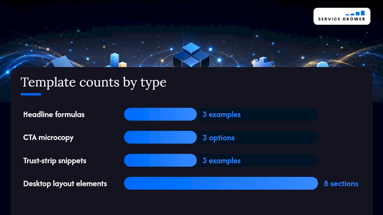
You don’t need to write from scratch. Here are formulas that work across most service categories, with the wording adjusted for your audience.
Headline formulas by audience:
- Local trades: “[Service] for [City] homeowners who need [outcome] [timeframe].” Example: “Roof repair for Denver homeowners who need leaks fixed before the next storm.”
- B2B services: “[Outcome] for [industry] teams without [pain point].” Example: “Payroll compliance for small manufacturers without the audit headaches.”
- SaaS/software services: “[Metric improvement] in [timeframe] for [audience].” Example: “Cut onboarding time in half for support teams.”
CTA microcopy by purpose:
- Booking: “Book my appointment” performs better than “Submit” because it names the outcome, not the action.
- Quote requests: “Get my free quote” outperforms “Request a quote” in most tests because it’s personal.
- Audits or diagnostics: “Check my [thing] for free” works well when you’re offering a no-cost evaluation before a paid service.
Trust-strip snippet formulas:
- “[Star rating] from [number]+ [city/region] customers.”
- “Licensed, bonded, and insured since [year].”
- “[Number] projects completed in [industry/region].”
For layout, keep desktop wireframes to hero, trust strip, three-column benefits, process steps, testimonial carousel, pricing, and final CTA in that order. On mobile, stack everything vertically and keep the CTA button sticky at the bottom of the viewport rather than letting it scroll away after the hero.
Design And UX Choices That Move The Needle
Visual hierarchy decides whether a visitor reads your page or bounces in three seconds. A few rules apply almost universally, regardless of industry or CMS.
- Hero visuals. Use a real photo of your team or work, not a stock image of people shaking hands. Compress hero images for mobile so they load in under two seconds on a typical connection.
- CTA contrast. Your primary button color should not appear anywhere else on the page. If your brand color is blue and half your icons are also blue, the CTA gets lost in the noise.
- Scannability. Keep paragraphs to 2 to 3 sentences and lines to roughly 60 to 75 characters. Long unbroken paragraphs are the single fastest way to lose a mobile reader.
- Accessibility. Maintain a 4.5:1 contrast ratio for body text, add descriptive alt text to every image, and make sure focus states are visible for keyboard navigation.
- Performance. Serve images in WebP format, lazy-load anything below the fold, and limit yourself to two font families total.
Pro Tip: Test your service page on a real phone with one hand, thumb-only. If you have to stretch or double-tap to hit your CTA button, so will your visitors, and most of them won’t bother.
Your Pre-Launch Service Page Checklist
Run through this before you publish, and again 30 days after launch to see what’s working.
- Headline names the service, audience, and outcome in one line.
- Primary CTA is visible without scrolling, on both desktop and mobile.
- Trust signal (rating, certification, or client count) appears above the fold.
- Who-for and who’s-not-a-fit language appears near the top.
- Scope section lists 4 to 6 concrete deliverables.
- Process section shows 3 to 5 steps with timeframes attached.
- Pricing shows a starting figure or range, not just “contact us.”
- Testimonials have permission on file, and licence numbers appear if your industry requires them.
- Meta title, meta description, and Service schema are filled in correctly.
- Click-tracking is set up on the CTA button and the contact form submission event.
| Area | What to check | Primary KPI to watch |
|---|---|---|
| Hero and CTA | Above-fold clarity and button visibility | Click-through rate on primary CTA |
| Content | Scope, process, and pricing clarity | Time on page, scroll depth |
| Proof | Testimonial placement and legitimacy | Contact form submissions |
| Technical SEO | Schema, meta tags, mobile speed | Organic impressions and rankings |
What We’ve Learned Fixing Service Pages For Small Businesses
The most common mistake we see isn’t bad design. It’s a page trying to be everything to everyone, listing fifteen services with no clear entry point. Fix that, and bookings usually follow, because visitors stop guessing which service applies to them.
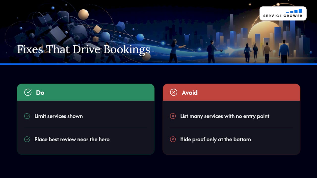
The second mistake is proof placed only at the bottom, after most visitors have already left. Move your best review or a client result up near the hero, and you’re answering the “can I trust this business” question before it becomes a reason to bounce.
Small businesses that fix both of these tend to see review volume and inquiry counts climb within weeks, not months, simply because the page finally matches how people actually decide.
— Service Grower
Build Your Service Page With Service Grower
Writing and designing a converting service page takes real time, and most small business owners already have a full plate running the actual business. Service Grower’s AnswerReady websites are built specifically so local businesses show up correctly when customers search on Google or ask an AI assistant for a recommendation, with the structure, proof placement, and booking flow already handled instead of built from scratch.
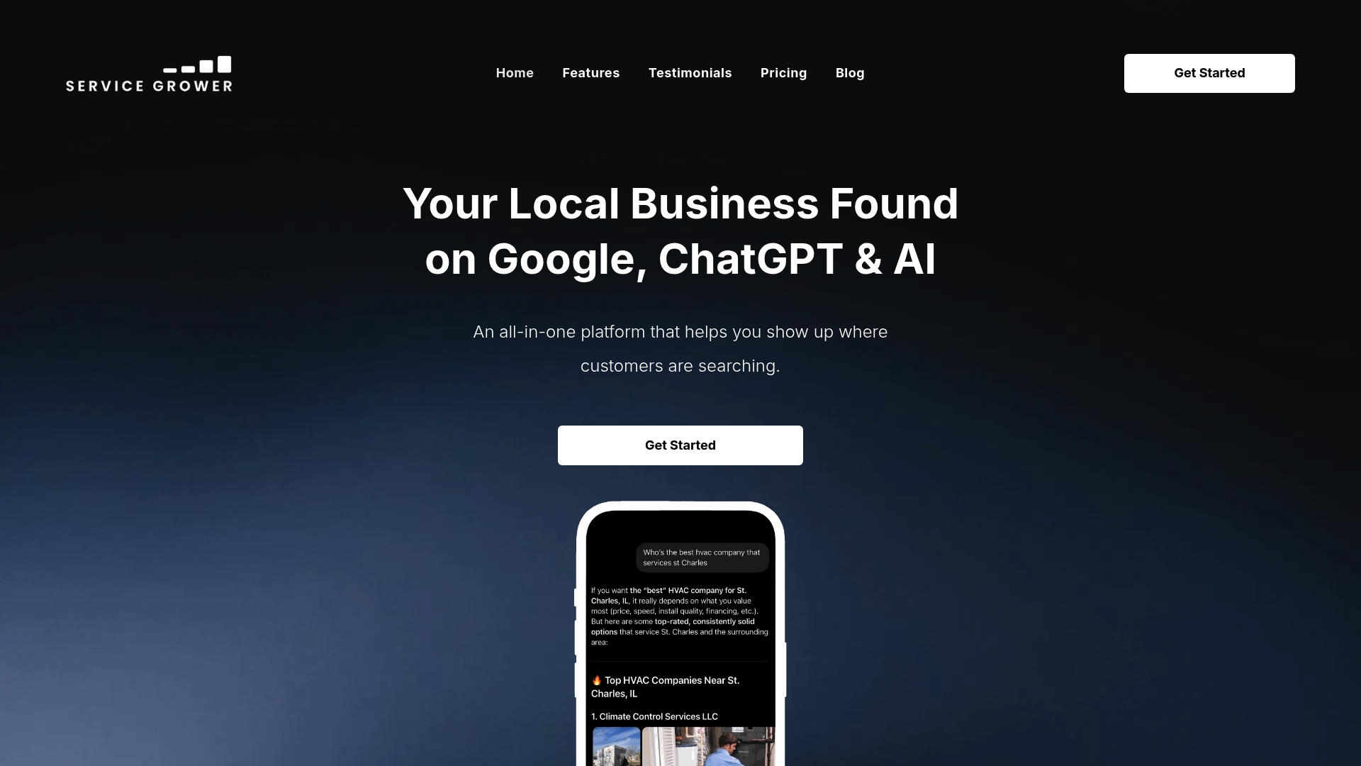
Beyond the page itself, the platform manages the pieces that keep a service page performing: booking requests, review collection, and lead tracking in one dashboard instead of five disconnected tools. If you want a quick read on how your current online presence looks to both search engines and AI tools before you rebuild anything, run a free AI visibility check and see exactly where the gaps are.
Sources
For deeper reading on service page structure, Squarespace’s design guide covers the nine essential elements with visual examples. SiteGround’s academy article explains why dedicated pages outperform a single catch-all page. Branded Web Design’s audit breaks down the seven-section blueprint referenced throughout this piece. For structuring copy around search intent, SEO Informatica’s guide walks through answering visitor intent early and placing proof near the CTA.
- Service Page Design: Complete Guide and Examples
- Service page (SiteGround Academy)
- Service Page Design: 7 Sections That Turn Visitors Into Inquiries